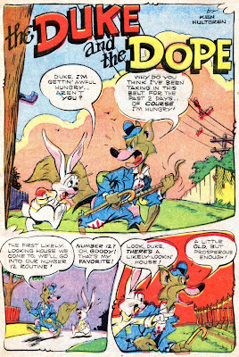
This story of two free-loading funny animals that bite off more than they can chew is from the same talent-drenched issue of Giggle Comics as the Superkatt story of last post (look for a Jack Bradbury story from same ish soon).
Ken Hultgren, like so many of the classic guys, was a Disney animator, specializing in animals. You can really see a Disney style in his work, particularly in the cute, little rabbit, The Dope. Boy, if you like kids' comics, the mid to late 1940's was really a time when giants walked the earth.
This is from Giggle Comics No. 46, October, 1947. All scans are from my own comic. Click the image for the big picture.


 This ad is from the same issue. "Good Luck to You Girls! Boys! Women! Men!" I loved the fonts used in these old ads. Simple ads like this demonstrated a neat sense of graphic design.


I love the shape and the layout of the panels. Thanks for sharing this!
ReplyDeleteJacque: Me too. That cool, snaky curve of panel layout was prevalent in many of the comics of the day. I think it gave the page a smooth, rounded look. Thanks for stoping by. -- Mykal
ReplyDeletegreat illustrations! although it was funny and made for kids, the creators seemed like they really took it seriously.
ReplyDeleteIt's HUltgren---I'm not really a fan of his, but THIS story appears to be inked by Al Hubbard (who I LOVE)--it looks better than usual.
ReplyDeleteKeith: Yeah, these guys took it very seriously. They were real professionals, and what always impresses me is that comics were not as highly thought of then as now. I'm sure guys like Hultgren and Gordon never imagined we would be looking at this stuff 6 decades after the fact. Still, look at the level of work!
ReplyDeleteJim: Thanks so much for the correction. Those kinds of typos are always so embarrassing, and I’m grateful you caught it quick so it wouldn’t hang out there in the blogosphere for long. I’ve made the correction. I should do this when I am less tired. Considering Hultgren put his signature on the title page, the mistake is particularly sloppy.
Hultgren isn’t my favorite artist from this era (I am liking Jack Bradbury the more I see of him), but I still like his work a lot. According to the Grand Comic-Book Database, this story was inked by Hultgren as well as penciled. I can't say I am familiar enough with Hubbard's inking style to have an opinion beyond that. -- Mykal